Why Monitor Choice Matters for Coders and Writers
If you spend most of your day staring at lines of code, documents, or long-form text, your monitor is more than just a display—it’s your working environment. Unlike gaming or media consumption, where motion and color take priority, text-heavy work demands clarity, consistency, and comfort over long periods.
A poorly chosen monitor doesn’t just look bad—it actively slows you down. Blurry fonts, cramped screen space, or awkward positioning can lead to constant refocusing, mental fatigue, and even physical discomfort. Over time, that translates into reduced productivity and avoidable strain.
On the other hand, the right monitor becomes invisible in the best possible way. Text is crisp, layouts feel natural, and your eyes don’t fight the screen. That’s when you can focus entirely on your work—whether that’s debugging a complex function or editing a long article.
This isn’t about chasing specs. It’s about choosing a tool that supports how you actually work.
What Actually Matters in a Monitor for Text Work
Not all monitor features are equally important for coding and writing. Some specs look impressive on paper but offer little real-world benefit. Here’s what you should prioritize—and why.
- Resolution and Screen Size: This is the foundation of text clarity. A 27-inch display with QHD (2560 × 1440) resolution hits a sweet spot for most users. It provides enough space for multiple windows while keeping text sharp without scaling headaches. Full HD can feel cramped at this size, while 4K offers superior sharpness but often requires UI scaling to remain usable.
- Panel Type (IPS vs Others): IPS panels remain the best choice for text-heavy workflows. They deliver consistent brightness and color across the screen, which matters when you’re scanning lines of code or paragraphs of text. TN panels may be cheaper but often suffer from poor viewing angles and uneven brightness.
- Pixel Density (PPI): This is often overlooked. Higher pixel density means smoother font rendering. If you’ve ever noticed jagged edges on text, that’s usually a low PPI issue. Moving to QHD or 4K dramatically improves this.
- Refresh Rate: You don’t need 144Hz for writing code. A stable 60Hz or 75Hz display is perfectly adequate. Higher refresh rates won’t improve readability, so don’t pay extra for them unless you also game.
- Ergonomics: Height adjustment is not optional—it’s essential. A monitor that can tilt, swivel, and pivot allows you to maintain a neutral posture. This becomes critical during long sessions.
- Eye-Care Features: Flicker-free backlighting and low blue light modes help reduce fatigue. While not magic solutions, they make a noticeable difference during extended use.
- Connectivity: USB-C is increasingly valuable, especially for laptop users. A single cable for power, display, and peripherals simplifies your setup significantly.
Recommended Monitors That Actually Make Sense
There’s no single “best” monitor—only the best fit for your workflow. These models stand out because they prioritize the right things for text-heavy use.
| Model | Best For | Key Strength | Trade-Off |
|---|---|---|---|
| Dell UltraSharp U2723QE | Professionals, multi-device setups | Extremely sharp text, excellent USB-C hub | 4K scaling may require setup |
| LG 27QN600-B | Budget-conscious users | Great balance of clarity and price | Limited ergonomics |
| BenQ PD2700Q | Long work sessions | Strong eye-care features | Less modern connectivity |
| ASUS ProArt PA278CV | Developers + creative work | Accurate display, reliable performance | Slightly higher cost for QHD |
What matters here isn’t brand loyalty—it’s choosing based on your workflow. For example, if you constantly switch between a laptop and desktop, USB-C becomes a major advantage. If you sit for 8–10 hours a day, ergonomics and eye comfort should outweigh everything else.
How to Set Up Your Monitor for Maximum Comfort
Even the best monitor can feel uncomfortable if it’s poorly configured. Small adjustments can make a big difference.
- Use proper font rendering: Enable ClearType on Windows or equivalent settings on macOS/Linux. This significantly improves text smoothness.
- Match brightness to your environment: Many people run their monitors too bright. A good rule: your screen should not look like a light source in the room.
- Correct positioning: The top edge of your monitor should be at or slightly below eye level. Too high, and you strain your neck; too low, and you hunch forward.
- Distance matters: Keep the monitor about an arm’s length away. Sitting too close exaggerates pixel structure and causes eye fatigue.
- Leverage window management: Split your screen efficiently instead of constantly switching tabs. This is where higher resolution pays off.
- Consider vertical orientation: Rotating one monitor into portrait mode is extremely useful for reading long code files or documents.
A well-configured setup often matters more than upgrading hardware.
When Premium Features Are Worth It—and When They’re Not
It’s easy to get pulled into high-end features that sound impressive but offer limited real value for text work. Here’s how to decide what’s actually worth paying for.
Worth considering:
- 4K resolution if you prioritize ultra-sharp text and your system handles scaling well
- USB-C docking to reduce cable clutter and simplify workflows
- Ultrawide displays if you prefer a single large canvas over multiple monitors
Usually unnecessary:
- High refresh rates (beyond 75Hz) for non-gaming use
- HDR support for text-based work
- Extreme color accuracy unless you also do design or photo work
Ultrawide monitors, for example, can be fantastic for multitasking—but they also force you to move your head more and can be less efficient for focused reading. Similarly, 4K displays look incredible, but poor scaling can make text too small or inconsistent across apps.
The key is alignment with your workflow, not chasing specs.
Common Buying Mistakes That Cost You Productivity
Many people end up with the wrong monitor—not because they didn’t research, but because they focused on the wrong criteria.
- Buying based on trends: Just because ultrawide or 4K is popular doesn’t mean it fits your setup.
- Ignoring ergonomics: A fixed-height monitor can quietly ruin your posture over time.
- Underestimating resolution: Going too low makes text fuzzy; going too high without proper scaling creates usability issues.
- Overlooking connectivity: Missing USB-C or enough ports can complicate your entire desk setup.
- Assuming bigger is always better: A large monitor on a small desk often leads to poor viewing angles and discomfort.
A smarter approach is to evaluate how you actually work day-to-day—not how you think you might work in the future.
FAQ – Practical Answers to Common Questions
What resolution should I choose?
For most users, QHD (2560 × 1440) offers the best balance of clarity and usability. It provides enough space without forcing you to deal with scaling issues.
Is 4K overkill for coding?
Not necessarily. If you value crisp text and your operating system handles scaling well, it can be a great upgrade. Just be prepared to tweak settings.
Is a dual-monitor setup better than ultrawide?
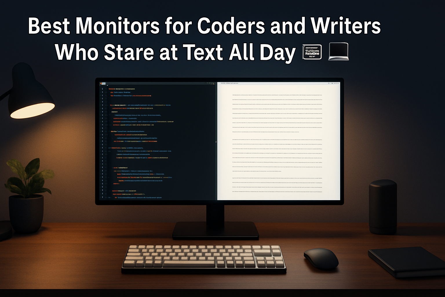
For many developers and writers, yes. Two screens provide natural separation between tasks (e.g., code on one side, documentation on the other) without relying on window management.
Does dark mode reduce eye strain?
In low-light environments, it can help significantly. However, in bright rooms, light mode may actually be more comfortable. It’s worth switching based on your environment.
Final Recommendation: Choose for Comfort, Not Just Specs
The best monitor for coding and writing is the one that disappears into your workflow. It should make text effortless to read, keep your posture natural, and reduce strain over long sessions.
If you’re unsure where to start, a 27-inch QHD IPS monitor with full ergonomic adjustment is a safe, high-value choice for most users. From there, consider upgrades like 4K or USB-C only if they solve a real problem in your setup.
Focus on clarity, comfort, and usability—not marketing features. That’s what actually improves your day-to-day work.